Showing posts with label Decorating. Show all posts

Thursday, March 27, 2014

DIY Ruler Growth Chart

It seems like these are all the rage! They are all over the blogosphere and honestly, I can see why. THEY ARE SO EASY! No really. E.A.S.Y. And they can be done over time without a lot of supplies, so you don't have to worry about your project junking up the dining room or garage or wherever you get your craft on.

Supplies
  • 6'x6"x1" Board. You can find these at ANY home improvement store. Look for one with some fun knots. I got mine at Lowes for under $7.
  • Small Can O' Stain. The stain manufacturers want you to think that stain is like paint. It's not. Go small. You'll seriously thank yourself later for not dropping a nice chunk of change on a big can you'll never finish. I used Early American 230 by Minwax 8oz.
  • Brush and Cloth for Staining. I used a foam brush to apply the stain and then wiped excess with an old kitchen towel.
  • Pencil.
  • Scissors.
  • Black Sharpie Marker.
  • This FANTASTIC Template. (This is a Microsoft Publisher file. Every time I tried to convert it to pdf or xps, my page would shrink and not maintain the correct measurements. Since it is a tracing template, I assumed you'd want the template to be correct.)
Instructions
  1. Stain your board. If you've never stained anything before, this is a great time to learn and make mistakes. Stain is pretty user friendly as long as you aren't in direct sunlight (the sun will warm your wood and make your stain a bit tricky to work with). Simply paint on and then wipe off the excess. I let my stain rest about 5 minutes before wiping. You might want to start with the sides or the ends to see if you like the color stain that you chose. Some woods suck up stain faster than others, so just make sure you are getting the color you want. If you aren't happy, try applying a wood conditioner first that will enable the wood to absorb a more accurate color. I probably applied 3 coats. And because I have 2 littles, I didn't wait between coats. If it felt dry, that was good enough for me. If you're planning to stain furniture, be a bit more picky! Out of my 8oz can, I probably have about 4oz left.
  2. Print out the DIY Ruler Growth Chart Template. The font for the numbers is Century 200pt (almost 2" tall). As for the notches, I used 4 different lengths and made them as chunky as the numbers so they would appear proportionate.
  3. Start with notches. Cut along the dotted yellow line. You'll need to decide where you want to start numbering. I started 6" up from the end of the board as my 1' mark. This will allow me to hang the board on the wall above the baseboards. It also allows me a few more inches above the 6' mark at the top (though I doubt any of our kids will come close to six feet tall). When you decide where you want your 1' mark, grab the notches print out! Turn it over on the back and scribble (with pencil) across each of the notches. Now turn the paper right side over and line up your desired 1' mark with the FOOT notch. The dotted yellow line should be flush with the edge of the board. Hold your paper steady and simply trace around each of the notches. This will transfer the scribbled pencil on to your board so that you can go back later and color them in with your Sharpie. You'll need to keep an eye out for HALF FOOT and FOOT notches, but the 5 shorter lines in between repeat just fine no matter what order. I found it easiest to simply mark all the HALF FOOT and FOOT marks first, then go back and fill in the 5 middle notches.
  4. Now onto the numbers! Each number has a solid line running through it. These solid lines divide up your number so that it aligns properly with the numbers above and below it on your board. For my board, I centered my numbers 3/4" away from the foot notches. I've marked those in red dotted lines. You could space them further at 1" away, noted in blue dotted lines. Turn your numbers over and scribble away. Turn the paper right side over, align end of foot marks with either red or blue dotted lines and the horizontal solid line, and trace.
  5. Finally, the most exciting part! Color in all of your traced lines with a nice Sharpie!
TADA! See, I told you it was easy!

Friday, March 15, 2013

Beach Cottage vs. Shabby Chic

What's the difference? Daily, I receive emails from Joss & Main, One Kings Lane, and a slew of other online stores selling beautiful things for fabulous prices. Sometimes as I scroll through their "sales" I'm drawn to specific styles, namely Beach Cottage and Shabby Chic (pronounced "sheek", from the French). But what's the difference?

Both styles are characterized by "light colors, neutral elements, and repurposed vintage items." The main difference lies in the way the styles make one feel. Feng shui??? Must be. Beach Cottage is relaxed and comfortable, while Shabby Chic is full of frills and fuss. The Cottage design lends itself to bright pops of colors (think coral, navy, chartreuse), whereas Shabby Chic follows a muted palette (think beige, soft pink, lilac). So which one am I? I feel the most comfortable with the Shabby colors, but am invigorated by those Cottage blasts. Maybe I'm a bit of both.

Check out this fun quiz, from Better Homes & Gardens, to help determine YOUR color personality! Apparently I am Blushing Pink:
"Bridging the dichotomy between sweet and sophisticated, this blush pink palette transcends styles and eras. Swirled with lavenders and minty greens, it carries you to a pastoral 19th-century English cottage. Or teamed with gray and black, or magenta and chocolate, the look evokes a Park Avenue flat circa 1950." 
 
...I really am stuck in the Shabby Chic color palette! HELP! 

Thursday, January 24, 2013

Coffee Filter Wreath

I've been working on my piano mantel and I'm so excited about the latest addition! I found this easy tutorial for a High Impact, Low Cost, Low Time wreath to hang over my painted window.

Supplies:
  • Hot Glue Gun
  • 200-pack Basic Coffee Filters
  • 36" Foam Pipe Casing 3/4" Wide (at Home Depot near the copper pipes) *UPDATE: Use a bulkier foam casing to ensure the wreath's shape. My foam has stretched and now my wreath resembles a large zero instead of a perfect O. I've also read that you can use standard foam forms, old grapevine wreaths, pool noodles, and even paper plates with the center cut out!
  • Packing/Duct Tape
Assembly:
  1. Cut foam to 36". (The foam from Home Depot will come in 6' sections for about $1.)
  2. Tape ends of foam with packing or duct tape.
  3. Fold filters. I did this rather fast and it worked just fine. I placed them inside one hand and pushed down with my fingers on the other hand to make them pointy in the center for glueing.
  4. Hot glue filters everywhere working your way around the foam. Come back and fill in any empty spots.

8 Straight Stitches + Hand Sewing = Pocket Bench Cover + Victory over the Mommy-Brain

Please ignore the unsightly air return...
I've been thinking through a rather simple concept for months: a cover for my foyer bench cushion that could easily be removed and cleaned when necessary. The trick to making something beautiful and removable is hours of thinking or store-bought. I was up for the challenge and so I began my quest! The measurements were simple to come by, it was those 8 stitches that threw me for a loop!

I purchased my foam at the local Army Navy store where they cut it to my specified dimensions. (In hind sight, I should have reduced my desired size to account for batting and fabric so that the final product didn't hang off the edge of the bench, but it was my first time, so I'll let that be my excuse.) Then I wrapped my cushion with some high loft batting I had left over from a quilting project. I made do without the spray adhesive, wrapped the batting, and hoped for the best. I'm sure it will need to be smoothed out after a few months of use, but that's the beauty of the pocket cover!

Here's how I did it!

Supplies:
Figuring out measurements...
  • Foam 15" L x 50" W x 1.5" H.
  • Fabric 37.25" L x 52.75" W. (If you want your pattern on a specific spot of the cover, you'll have to mark your starting line and measure back 1.5" to get the correct cut line.)
  • Coordinating Thread.
  • 9-10 Hook Fasteners like these. (Sure you could try Velcro, but I didn't like how far apart my pocket pulled. The fasteners give you a much cleaner line.)
  • Sewing Machine.
  • Needle.
  • Scissors.
Assembly:
  1. Iron the 52.75"W sides 1/2" and then another 1/2" to create a beautiful hem line. Ironing eliminates the need for pins and gives you such a smooth surface to work with.
  2. Stitch along the ironed edges to create your pocket hem.
  3. Fold the fabric just over the halfway mark (one side will measure 17" and the other 17.5") with the right sides together.
  4. Stitch down the unfinished sides with 1/2" seam allowance. (The fabric now resembles a large pocket that you'll be able to slide the cushion in lengthwise.)
  5. Create box pleats in all 4 corners. I drew a chalk line at 45* and then drew a perpendicular line once the width of the triangle was 1.5".
  6. Turn the cover right side out and your pocket will automatically appear! (I struggled to figure out how to reverse the direction of my pocket until I was working on my hand sewing of the fasteners. If you want to reverse the direction of the pocket, simply make your longer side of the "half" fabric on top rather than on the bottom. Oh, Mommy-Brain, one day you'll give way to my full capabilities, I'm sure of it!) 
  7. Finally, hand stitch your fasteners in place. I started with my bars first and placed those 3/4" from the edge of the inside fabric on my pocket. I placed the hooks 1/8" from the top of the fabric on the adjacent fabric of the pocket.
 
Crisp Box Pleat
Pocket of the Cover (normally faces said air return)

Thursday, December 13, 2012

Painting Navy

Window/wreath above the piano
Inspiration (thanks, Pinterest!)

My neighbor's old window has been leaning up against my garage wall for over a year now, and I think I've finally devised a CONCEPT for it. It will be called a "concept" simply because I have NO idea if this will actually work in the real world. I'm what you might call design-challenged.

I have decided to paint the old window a deep navy blue and hang it above the piano. Ideally, I'd like to use this window as the backdrop of all kinds of seasonal décor since our fireplace mantel is crowded out by our not so small TV. I chose navy simply because it goes with SO MANY other colors. However, I went the cheap route on paint. Why oh why do I do this to myself? The man at Walmart couldn't figure out how to pull up the mix list for the Ben Moore color I had originally chosen, so I grabbed a paint chip from their selection that I thought matched. Did I take it outside? Nope. Sure the colors matched under fluorescent lighting....but I don't have any flourescents in my living room. Result: Royal Blue instead of Navy. The Royal Blue is a bright, saturated, delicious color, but not what I wanted. Taking a cue from my friend Julie, I went in search of other paint cans in the garage to mix the color I desired.


First of all, it's important to note that you should never try to mix paint that's been mixed in the store. There are too many factors that will play into the final paint result, such as texture, sheen, and the fact that there might be a rainbow of added colors if you didn't mix them well enough. However, I only worry about that if I'm attempting to mix paint for walls. Small pieces aren't a big deal to me! So I mixed my Stunning Navy with Black exterior paint. If you can't tell a difference from the left image and the two on the right, you might be color blind.....or my camera did a poor job of capturing the difference. Either way, I'm much happier with the mix! Be warned though: mixed paint takes FOREVER to set up!

Tuesday, November 15, 2011

Nursery Update - Evolution of a Dresser

We have been busy cleaning out the bedroom that will soon transform into Miss S's nursery. We chose Sherwin Williams Creme and painted 2.5 coats. Sadly, the color came out looking more cool than warm, but the cost of the paint outweighs our desire to repaint. We are simply going to work through the problem! I've spent the last few weekends looking for colors that would go well together, a task that is of utmost difficulty for me. We've decided on a garden theme with greens, purples, and pinks. Pinterest has also been a help in our search for design ideas.

Our first purchase was the dresser that we will repaint to use as a changing table. I love the height. The top 3 drawers are also double-deep, which will come in handy for storing lots of diapers. We found the dresser at a consignment shop for $111. Brian has since stripped the piece, and we are waiting for our neighbor to help us even out the drawers (they are a bit tilted from age).

UPDATE: August 2012
We're still working on the nursery :) Sophia surprised us almost a month early, so give us a break! Here's a shot of the changing table now. We ended up using the original hardware because it looked fabulous with the Sage Milkpaint and Brown Glaze! (Note to self, when working with glaze, don't do it outside where the sun can warm the wood. It makes it so difficult for the glaze to spread smoothly and evenly.)

I really love the dot mobile I've got hanging from fishing line just above the changing area. I can give it a blow and it amuses Miss S almost the entire time I'm changing her.


Thursday, March 24, 2011

French Doors


Last Friday, a friend of ours installed our French Doors between the living room and dining room. I really need to upload pics to show you how incredible they look! It's funny when Brian and I look back over the last 2 years here and realize how much our home has matured! (Bachelor furniture only lasts so long!)

Sunday, March 13, 2011

My Guest's Work of Art!

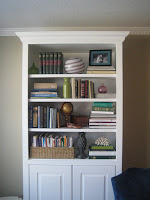
Well, all that research on bookshelves was nice, but when it came to implementation, I just didn't get it. I tried a few patterns of shapes, sizes, and colors that I found online, but I couldn't complete the design to fill the entire space. So I called my friend Sarah and asked for her help. Within an hour, she had all the shelves stocked and looking beautiful! It was like a beautiful ballet as she grabbed books (which I thought were impossible to use), and turned them backwards! She brought in so many colors and textures. I love the glass she incorporated. One thing I did learn after our adventures in decorating was that a picture cannot truly capture the look of a bookshelf. There are whimsical shadows that disappear with a camera's flash. I also learned that bookshelves look different from different angles. The pictures below make the shelves look empty, but when viewed from the couch with the lighting from the bay window or the ceiling fan, they look full and warm! Thanks again, Sarah!!!! You are my hero!!!
Related Posts Plugin for WordPress, Blogger...